Alabaster White Sherwin Williams: Why This Soft White Stands the Test of Time
If you’ve spent any time picking paint colors (and stressing over swatches like the rest of us), you’ve probably come across Alabaster White Sherwin Williams. As a designer, I see a lot of white paints—and trust me, they are not all the same. But Alabaster White is one that I reach for again and again because it’s warm, soft, and just plain easy to live with.
1. Overview of the Color
Contents
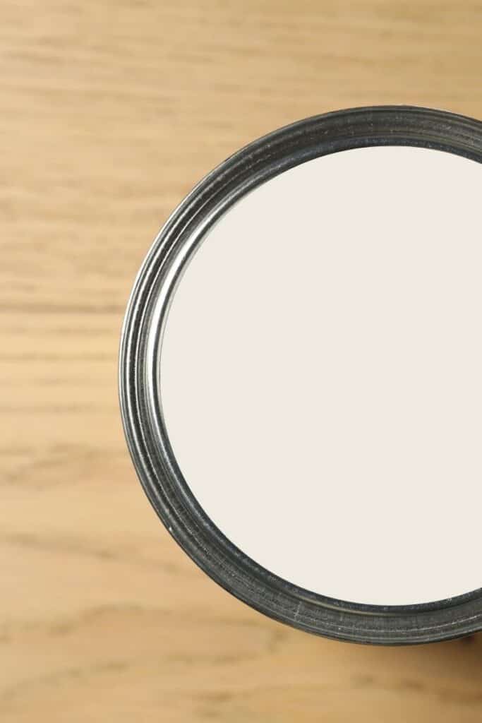
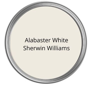
Sherwin Williams Alabaster White (SW 7008) is one of those perfect neutral whites that works in almost any home. It has an LRV of 82, which means it reflects a lot of light but doesn’t feel stark or cold. Think cozy, creamy, and clean—all at the same time.
I always recommend ordering a peel-and-stick sample from Samplize. It makes it so much easier to see how Alabaster White walls will look in your space before committing to gallons of paint.
It also leans warm without going yellow, which is why I love using white Alabaster in spaces that need a soft and inviting feel. If you want a calm, timeless white that doesn’t feel icy, this is your color.
2. How Alabaster Stacks Up Against Other Sherwin Williams Whites
White paint comparison time! These are the comparisons people ask about the most, so let’s go through them in easy, real-life terms.
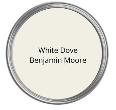
Alabaster vs White Dove
When people ask about Alabaster vs White Dove, they’re usually looking for a warm white. While White Dove is from Benjamin Moore, it comes up a lot. White Dove is a little cooler and grayer. Alabaster White is warmer and creamier. If you want soft and warm, go Alabaster. If you want something clean with a bit more gray, White Dove wins.
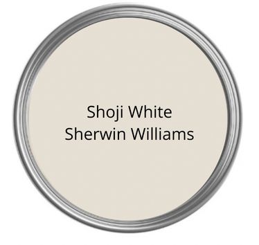
Alabaster vs Shoji White
Next up—Alabaster vs Shoji White. Shoji White has more beige in it, almost like a light greige. Alabaster is lighter, brighter, and more of a true warm white. Shoji White can look tan in certain lighting, while Alabaster stays creamy without drifting into beige. Read my complete review on Shoji White here!
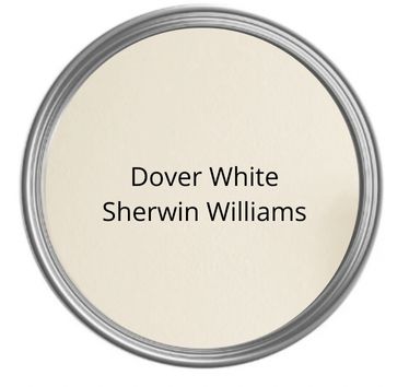
Alabaster vs Dover White
Alabaster vs Dover White is another big one. Dover White has stronger yellow undertones. In bright light, it can even look a little buttery. Sherwin Williams Alabaster White stays more neutral and doesn’t flash yellow, which makes it easier to pair with trim and furniture.
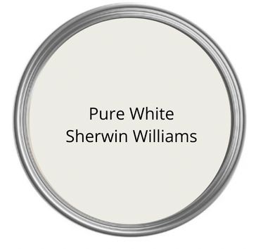
Alabaster vs Pure White
This comparison comes up the most: Alabaster vs Pure White. Pure White (SW 7005) is cooler and crisper. It has a slight gray undertone that keeps it from feeling too warm.
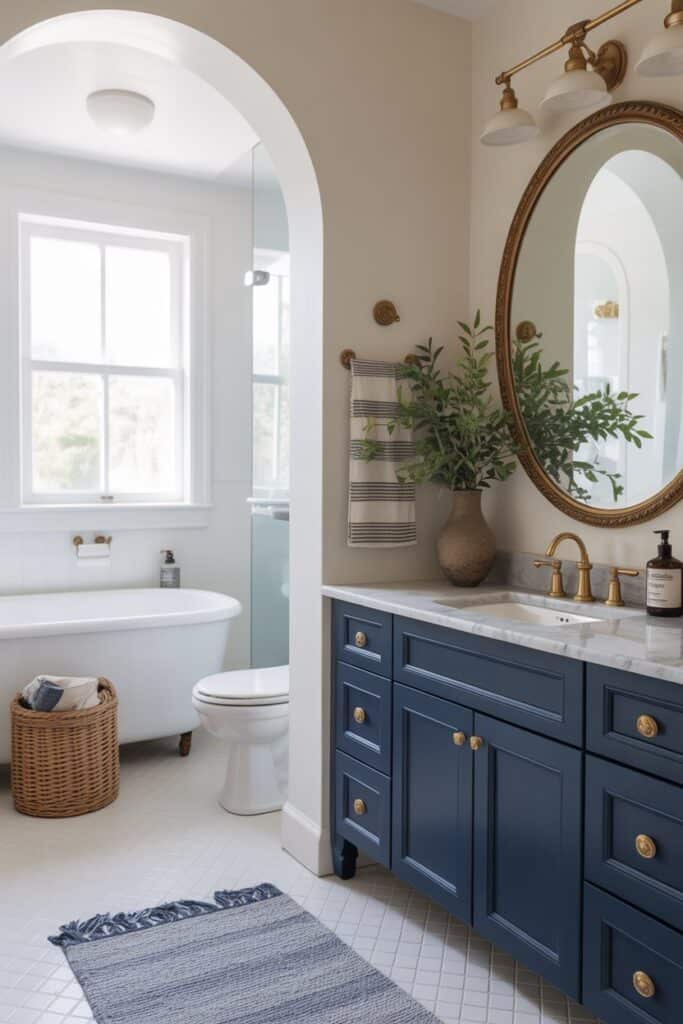
A lot of people ask if they can do Alabaster walls with white trim. Yes—you absolutely can. In fact, SW Alabaster walls and pure white trim is one of my favorite combinations. The trim looks fresh without making the walls look dingy.
This pairing creates a soft contrast that feels high-end but still warm and welcoming. Alabaster walls with Pure White trim is a go-to in many homes.
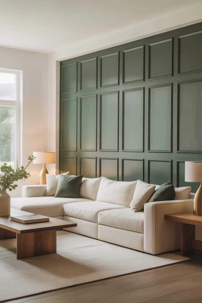
3. Colors That Go With Alabaster White
If you’re wondering about colors that go with Alabaster White, you’ve got options. Because Alabaster is soft and warm, it plays nicely with both bold and muted shades.
Here are some of my favorite pairings:
Sherwin Williams Naval
SW Naval is a deep navy blue that looks stunning next to Alabaster. The contrast is bold but classic.
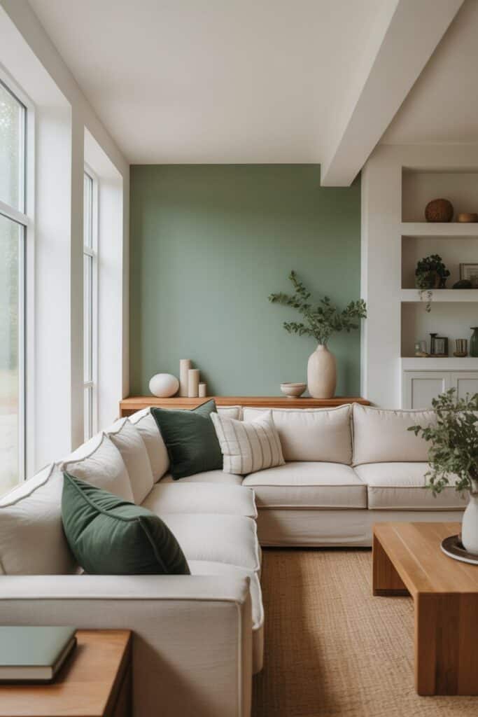
Sherwin Williams Evergreen Fog
Evergreen Fog is earthy and calming. When you put it next to Alabaster White, the warmth of the white brings out the richness of the green.
Sherwin Williams Iron Ore
For dramatic contrast, Iron Ore is almost charcoal-black and looks incredible with Alabaster (especially on exteriors—more on that below).
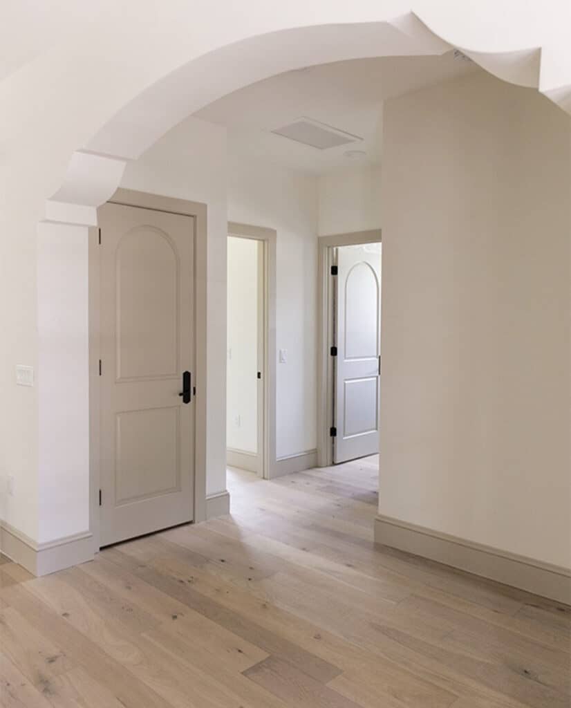
Sherwin Williams Accessible Beige
This is a warm greige that blends beautifully with Alabaster without getting too dark. This hallway by Jenna Sue Design Co. uses SW Accessible Beige on the doors and trim. Check out my review on Accessible Beige here.
Sherwin Williams Repose Gray
A soft gray that adds a cool balance to Alabaster’s warmth.
These colors make it easy to build a palette for an open-concept home or any room where you want a cohesive flow.
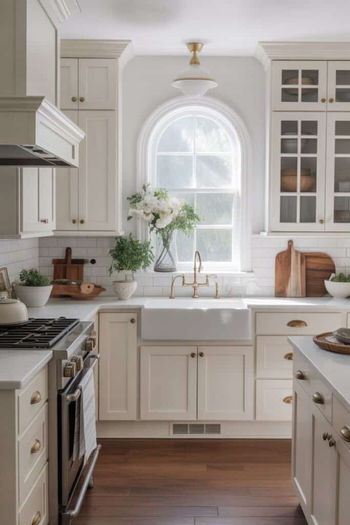
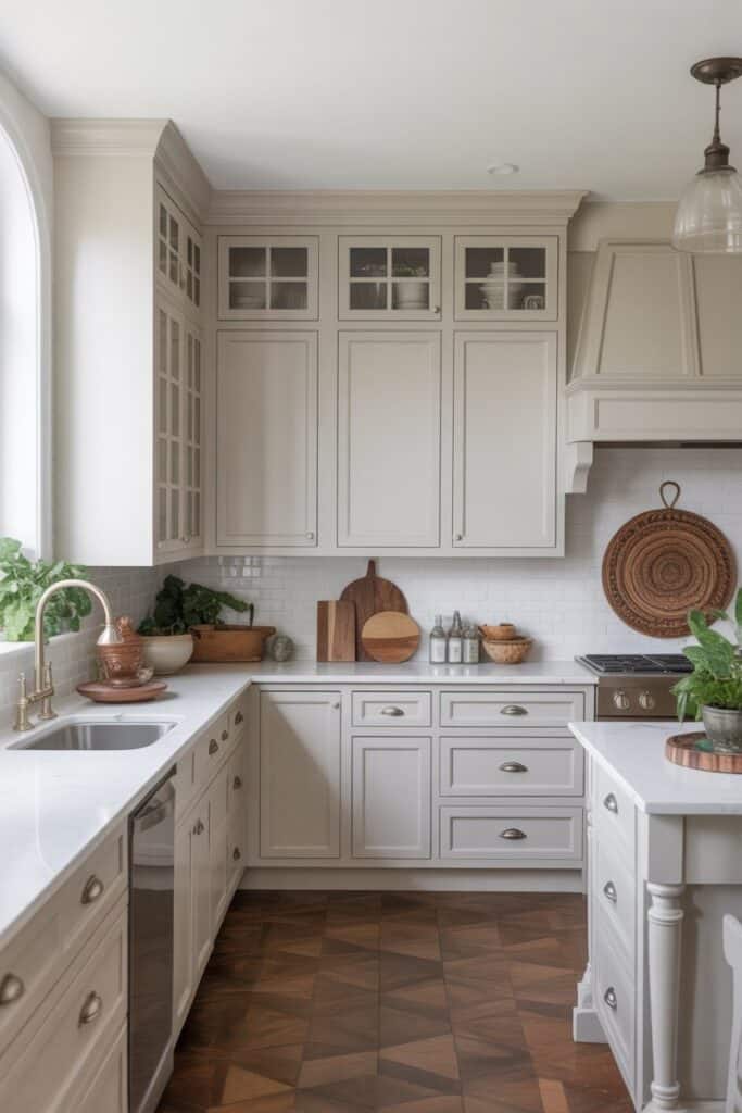
4. Alabaster in the Kitchen
Now let’s talk kitchens—because alabaster white kitchen cabinets might be one of my favorite uses for this color.
Alabaster cabinets feel bright and timeless but still warm. They don’t scream “stark white,” and they hide everyday smudges much better than cool whites do.
Pairing Alabaster cabinets with white quartz countertops is a dreamy combination. The creamy warmth of Alabaster next to the crisp, clean look of white quartz keeps the space feeling fresh but not too cold. It’s great for farmhouse, modern, traditional—you name it.
If you don’t want your kitchen to feel too stark or too beige, Alabaster hits that perfect balance.
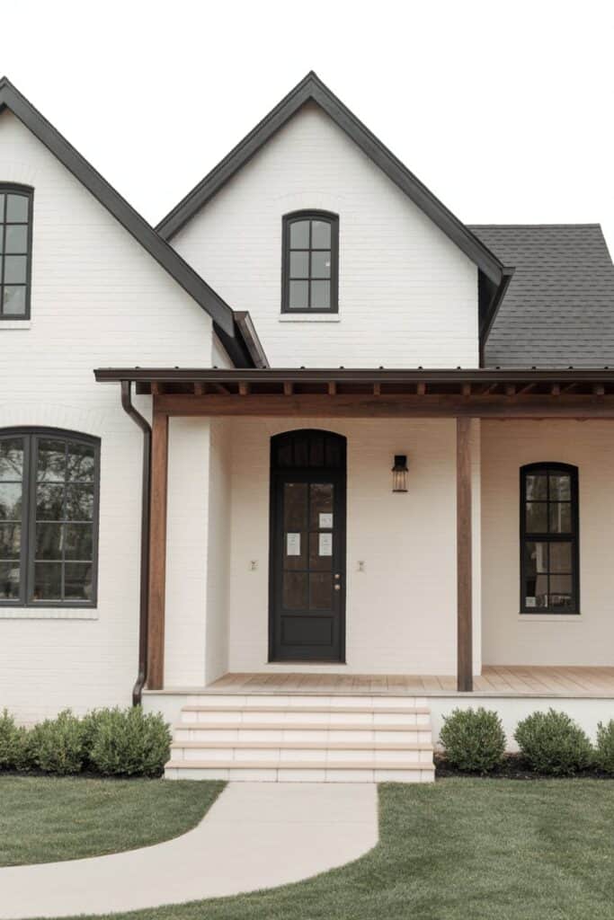
5. Alabaster White Exteriors
If you love modern farmhouse exteriors or classic white homes, you’re probably already eyeing Alabaster White exterior paint. And you should be—because it’s one of the most popular exterior whites for good reason.
It doesn’t glare in full sun the way cooler whites do. Instead, it looks warm, soft, and welcoming.
One of my favorite exterior combos is Alabaster White and Iron Ore exterior. Alabaster on the main body of the house with Iron Ore on the trim, shutters, or front door is a total showstopper. The contrast is bold but still classy.
You can also pair Alabaster with natural wood, bronze windows, or stone accents. It works with so many styles—craftsman, farmhouse, cottage, ranch, or traditional brick.

6. Wrap Up
So, is Alabaster White Sherwin Williams worth trying in your home? Absolutely. Whether you use it for Alabaster White walls, cabinets, trim pairings, or your entire exterior, it’s one of the most flexible whites out there.
It’s warm without being yellow, bright without being harsh, and soft without feeling beige. It works in old homes, new builds, modern spaces, and cozy cottages.
If you’re looking for a neutral white that feels peaceful, timeless, and easy to pair with other colors, Alabaster White might just be the winner.
And if you ever feel stuck choosing whites—trust me, you’re not alone. Even designers have to test them. Ordering Samplize samples and looking at them in your own lighting is always the best place to start.