
Sherwin Williams Celery vs. Behr Grounded: Comparing the 2027 Green Paint Colors of the Year
Fall is settling in, and I’m ready for cozy layers, warm wood tones, and a little seasonal decorating. While orange and rust usually get all the attention this time of year, earthy green paint colors deserve a spot in your fall color palette, too!
And apparently, the paint brands agree. Sherwin Williams chose Celery SW 6421 as its 2027 Color of the Year, while Behr went with Grounded T27-01.
Both bring a little of the outdoors inside, but they have very different personalities. Celery is light and fresh. Grounded is deep and earthy. If you’re thinking about adding green to your home, let’s talk undertones, lighting, and where each shade could work best.
Sherwin Williams Celery: A Fresh Take on Light Green Paint Colors
Contents
Celery Undertones and LRV
If you’ve been browsing Sherwin Williams green paint colors, Celery is worth a closer look. It’s a soft, light green with subtle yellow undertones. That yellow gives it warmth and a fresh, leafy feel, making it an option to sample if you love warm green paint colors. If you’re picturing a cool sage with lots of blue or gray, this one takes a different direction.
Celery has an LRV of 71. A quick reminder: LRV stands for Light Reflectance Value and measures how much light a color reflects on a scale of 0 to 100. Higher numbers mean more reflected light.
At 71, Celery is a light paint color. It’s worth sampling if you want some color on your walls while keeping the room feeling open. I recommend ordering a large peel-and-stick sample from Samplize and checking it throughout the day in different lighting to see if it’s the choice for you!
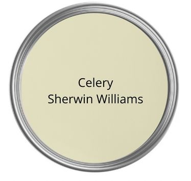
How Celery Could Look in Different Lighting
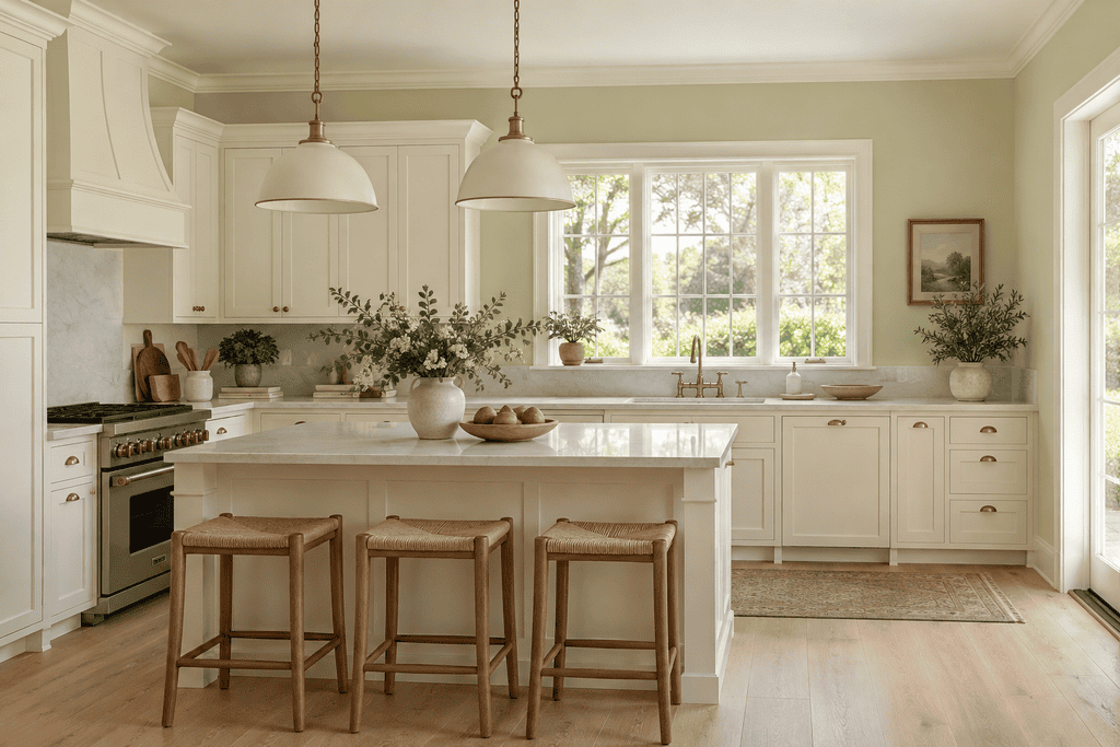
Based on its yellow undertones and light LRV, here’s what I’d watch for when sampling Celery:
- North-facing rooms: Cooler daylight may quiet some of the yellow warmth, giving Celery a softer, more muted look.
- South-facing rooms: Warm, bright daylight could bring out its yellow side. In strong sunlight, the color may also look paler.
- East-facing rooms: Expect a warmer look in morning sunshine and a more subdued green later in the day.
- West-facing rooms: Late afternoon sunlight could make those yellow undertones more noticeable.
- Artificial lighting: Warm bulbs may push Celery toward yellow-green, while cooler bulbs may make it feel less warm.
These are starting points, not guarantees. Your flooring, furniture, and even the trees outside your windows can affect what you see.
Coordinating Colors for Celery
I’ve already shared reviews of several colors I’d put on the sample board with Celery. These are pairings I’d try when building a palette for your home.
Sherwin Williams Alabaster: For soft white trim or cabinets, I’d start with Alabaster White. Its creamy warmth could keep the palette feeling relaxed. Think Celery walls, Alabaster trim, and natural wood furniture.
Sherwin Williams Accessible Beige: Want a neutral for an adjoining room? Accessible Beige is a warm beige with gray undertones. I’d sample it with Celery for a soft green-and-neutral combination that works with woven baskets, linen, and wood accents.
Sherwin Williams Evergreen Fog: For a layered green palette, I’d also try Evergreen Fog. It’s deeper and grayer, so the two won’t look like lighter and darker versions of the same paint. A small piece of furniture in Evergreen Fog could add depth to a Celery room. Check them together first, since Celery’s yellow side may stand out more beside a grayer green.
Behr Grounded: A Deep, Earthy Olive
Grounded Undertones and LRV
Behr Grounded is a mossy olive green with brown undertones. The brown gives it an earthy warmth and helps explain why it feels so different from Celery. If olive green paint colors have caught your eye, this shade belongs on your sample board.
If you started your search with Behr sage green paint colors, keep in mind that Grounded takes you into deeper olive territory. It could be worth a look if you want more depth than a soft sage.
Grounded has an LRV of 9, placing it firmly in the dark paint category. Compared with Celery’s 71, it reflects much less light. If you’re looking for a rich backdrop with plenty of depth, this is the one I’d sample first. Again, I would order a sample and live with it on the wall to see if it’s the color for you!
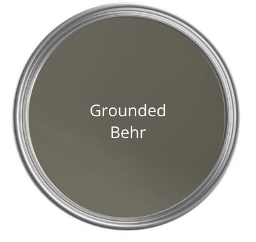
How Grounded Could Look in Different Lighting
With its low LRV and brown undertones, I’d expect Grounded to need a little more thought when it comes to lighting. Here’s what I’d look for:
- North-facing rooms: In cooler, dimmer daylight, it may look more muted and its green could be harder to spot.
- South-facing rooms: More daylight should help reveal the olive color, while warm sunlight may emphasize its earthy side.
- East-facing rooms: Morning sunshine could show more of its green, with a deeper look as the room loses direct light.
- West-facing rooms: Golden afternoon light may bring out more brown and olive warmth.
- Artificial lighting: Warm lamps could emphasize the brown undertones. In a dim corner, Grounded may read as a very dark neutral.
I’d check this sample with the lamps on, too. A color that looks beautiful at noon needs to work when you’re curled up on the couch after dinner!
Coordinating Colors for Grounded
For Grounded, I’d start with lighter neutrals to balance its depth. Here are three colors I’ve reviewed that I’d sample alongside it:
Sherwin Williams Alabaster: Alabaster would be my first sample for warm white contrast. Picture Grounded cabinets with Alabaster walls, wood accents, and brass hardware. You’d get plenty of contrast without an icy white backdrop.
Sherwin Williams Accessible Beige: Accessible Beige is another option for a warm, earthy palette. I’d try it on the walls with Grounded built-ins or a painted hutch. The lighter neutral would give the dark green room to stand out.
Benjamin Moore Pale Oak: If you want a lighter greige, take a look at my Pale Oak review. I’d sample Pale Oak walls beside a Grounded vanity or kitchen island. Watch for any pink or violet cast in the Pale Oak sample next to the olive green—neutrals can surprise you when you put them beside another color.
Which Rooms Work Best for Celery and Grounded?
Where I’d Use Celery
Bedrooms: Celery would be on my list for a bedroom that needs gentle color. I’d pair it with soft white bedding, a wood nightstand, and a simple patterned rug.
Kitchens and breakfast nooks: This light green could be a fun backdrop for white cabinets or a cozy breakfast table. It has the kind of freshness I’d want in a sunny kitchen.
Bathrooms: I’d try Celery with a wood vanity and warm white tile for a soft, relaxed look. Sample it next to your tile first, especially if the tile has a cool undertone.
Living rooms: If you’re ready to move beyond neutral walls but still want a light backdrop, Celery is worth a look. Cream upholstery and natural textures would be my starting point.
Where I’d Use Grounded
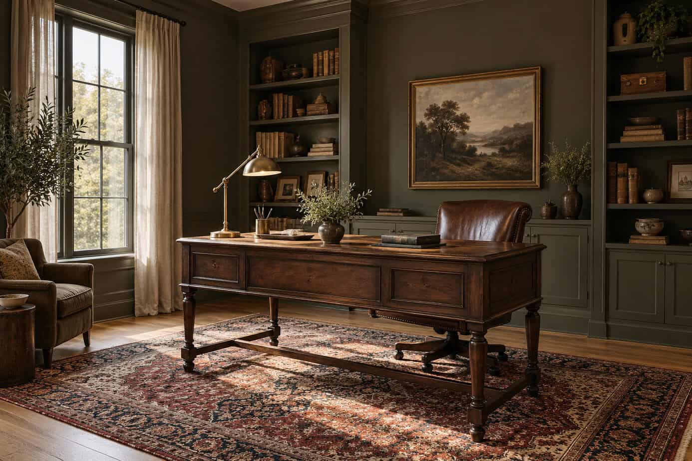
Dining rooms: If you love moody green paint colors, Grounded is the shade I’d try for a cozy dining room with a wood table and warm lighting. It could make a simple room feel a little more special.
Home offices: I’d love to see this color on office built-ins or behind a desk. Add an oriental rug and a good desk lamp to balance the depth.
Bedrooms: If your goal is a snug, restful retreat, I’d sample Grounded on the walls. Lighter bedding and curtains would help break up the dark color.
Kitchens: Comparing Behr green paint colors for a cabinet makeover? A Grounded island or lower cabinets would be a great way to try this green without painting every wall. I’d bring samples home and check them against the counters and backsplash before deciding.
Powder rooms: A small bathroom can be a fun place to go bold! Grounded could work with wallpaper, a wood vanity, and a pretty mirror. Plan enough lighting around the vanity so the room still works for everyday use.
Celery vs. Grounded: Which Would You Choose?
The best green paint colors for your home will depend on your lighting and the feeling you want to create. Celery and Grounded both bring green into the home, but the biggest difference is their depth. Celery gives you a light green with yellow warmth. Grounded gives you a dark olive with earthy brown undertones.
I’d lean toward Celery for a fresh bedroom, breakfast nook, or light living room. For a cozy dining room, rich cabinet color, or moody office, I’d start with Grounded.
Before buying gallons of either shade, grab a sample from Samplize and live with it for a few days. Check it in morning light, afternoon light, and with your lamps on at night. Hold your coordinating samples beside it, too.
Which one would you use in your home—the soft green of Celery or the deep olive of Grounded?
If you’re looking for other recommended greens, check out this article from Houzz: Pros Share 10 Beautiful Green Paint Colors