
5 Moody Fall Color Palettes That Aren’t Orange and Black
When you think of fall decorating, orange pumpkins and black accents probably come to mind first. And while there’s nothing wrong with a little Halloween fun, fall colors include so much more!
Think deep plum, olive green, burgundy, warm brown, and the soft glow of aged brass. These colors bring that cozy fall feeling into your home without making every room look ready for trick-or-treaters.
Moody interiors are having a moment, especially rooms with rich brown tones, cozy fabrics, and vintage details. And honestly, fall feels like the perfect time to try the look!
The best part? You don’t have to repaint your whole house. A few pillow covers, a patterned rug, or a thrifted brass lamp can help you build a beautiful fall color palette around what you already own.
Let’s look at five combinations you can use in a powder room, library, living room, entry, and more!
1. Plum, Mushroom, and Aged Brass
Contents
The palette: Deep plum, mushroom taupe, soft cream, and aged brass.
Plum is one of those colors that can feel a little intimidating until you see it paired with the right pieces. Choose a deep, muted shade instead of a bright purple, and it feels cozy and elegant.
I love the idea of this palette in a powder room. Picture plum walls, a wood vanity, a brass mirror, and creamy hand towels. A small piece of vintage art would finish it off beautifully!
For a smaller update, keep the walls neutral and bring in plum through a floral wallpaper, hand towels, or artwork. You can get that moody feeling without committing to dark walls.
In our half-bath makeover, we used an antique brass faucet and a stained wood countertop. Those same warm finishes would look so pretty with plum.
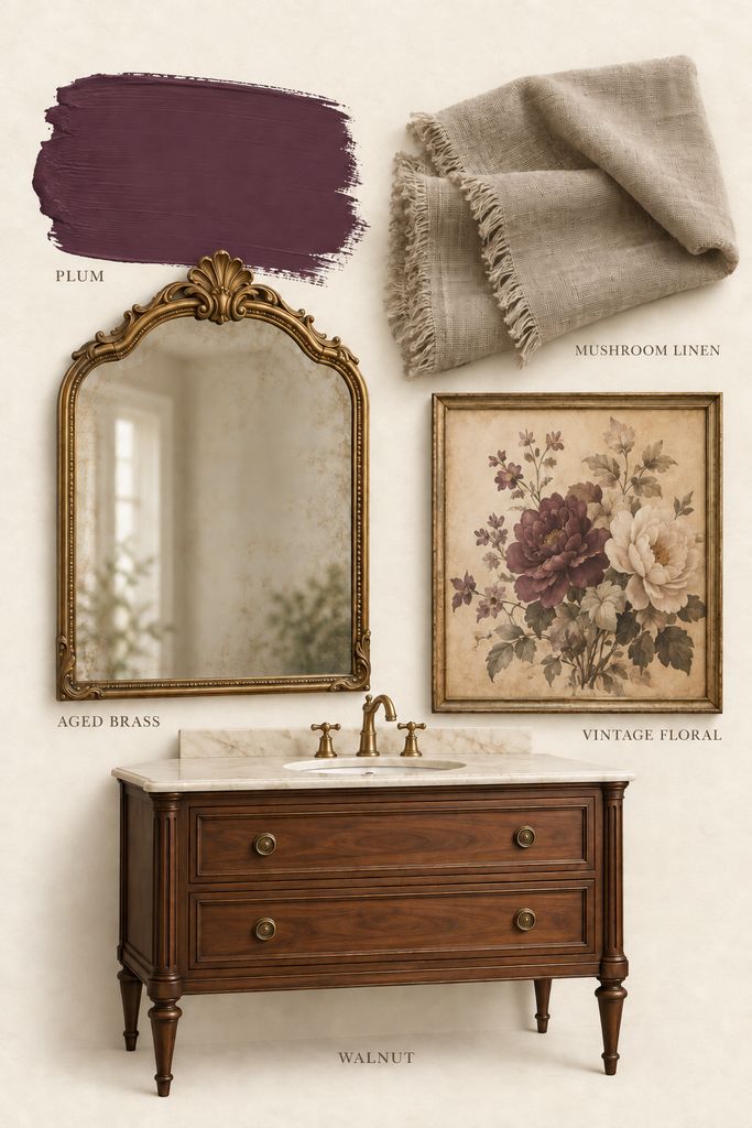
Want to try this look? Sample Carter Plum by Benjamin Moore in your space!
2. Olive, Walnut, and Cream: An Autumn Forest Palette
The palette: Earthy olive green, walnut brown, creamy ivory, and aged brass.
If you love decorating with colors found in nature, this autumn forest palette is a great place to start. Olive brings in the green, walnut adds depth, and cream gives your eye a place to rest.
This combination would be beautiful in a library or home office. Imagine olive walls or bookshelves, a wood desk, a cream upholstered chair, and a brass reading lamp. Add a faded patterned area rug, and you have a space that makes you want to grab a book and stay awhile.
Look for a rug with olive, brown, and a little burgundy in the pattern. It helps connect the colors without making everything match.
If you’re considering painted walls or built-ins, my guide to Benjamin Moore dark green paint colors is a good place to find inspiration. Sample your favorites next to your wood furniture before making a final choice.
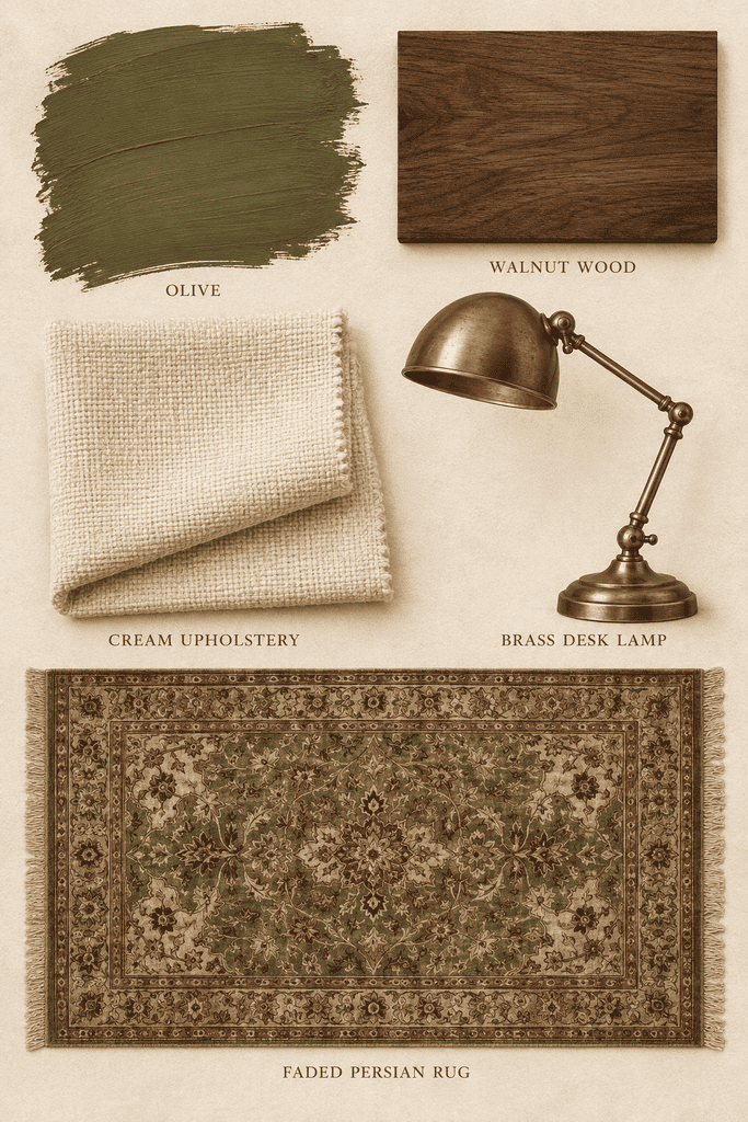
Want to try this look? Sample Oakmoss by Sherwin Williams in your space!
3. Burgundy, Caramel, and Oatmeal
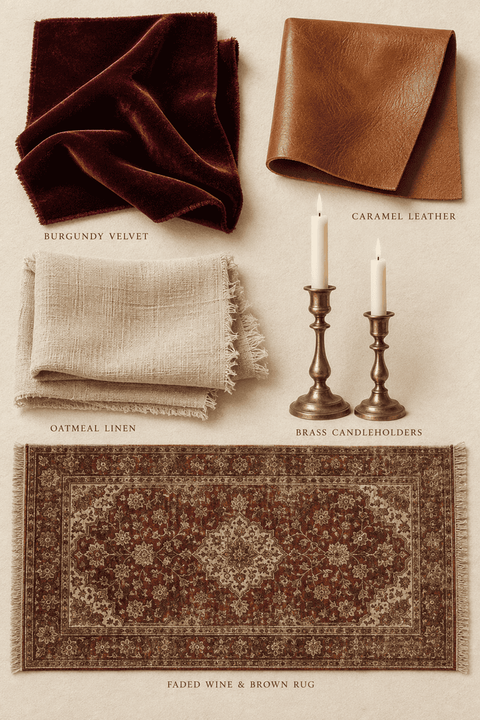
The palette: Deep burgundy, caramel brown, oatmeal, and aged brass.
This is such a pretty autumn harvest color palette for a living room. Burgundy brings the richness, caramel adds warmth, and oatmeal keeps the space from feeling too heavy.
You don’t need a burgundy sofa to make it work! Start with your neutral seating and add wine-colored pillow covers, a caramel throw, and a patterned rug that repeats both shades.
A wood coffee table and brass candleholders would look right at home here. For the mantel, try a few burgundy stems in a simple ceramic vase rather than filling every inch with seasonal decor.
These autumn harvest colors also work well in a dining room. Burgundy napkins, cream dishes, and warm wood make a pretty combination for fall dinners. I shared more seasonal table inspiration in my post on Thanksgiving tablescapes.
4. Chocolate Brown, Dusty Plum, and Warm Ivory
The palette: Chocolate brown, dusty plum, warm ivory, and aged brass.
Warm brown is one of the trending fall colors that feels easy to live with beyond the season. It works with so many pieces we already have, from wood furniture to woven baskets.
Pair it with dusty plum for a softer take on a moody room. Unlike the first palette, where plum takes the lead, this combination is mostly brown and ivory with just a little purple mixed in.
I’d use this look in an entry. Start with a vintage wood console, add a brass lamp with an ivory shade, and hang a landscape painting above it. A patterned runner with touches of plum would pull everything together.
For a seasonal accent, place a few branches in a pottery vase or add a bowl of small cream-colored pumpkins. Your entry can feel like fall without needing a complete makeover.
If you prefer lighter walls, keep them! Dark wood furniture and deeper accessories can create plenty of mood on their own.
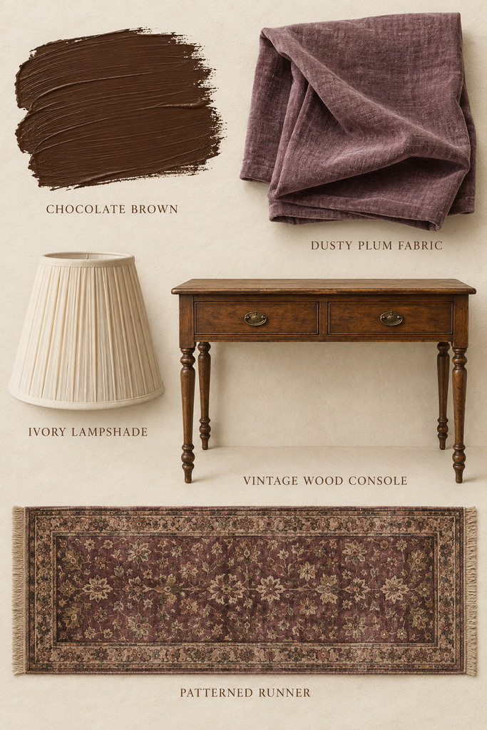
Want to try this look? Sample Chocolate Candy Brown by Benjamin Moore in your space!
5. Olive, Burgundy, and Warm Brown
The palette: Muted olive, deep burgundy, warm brown, soft cream, and aged brass.
This combination brings several of my favorite fall aesthetic colors together. It’s rich and layered, but keeping the shades muted helps it feel relaxed.
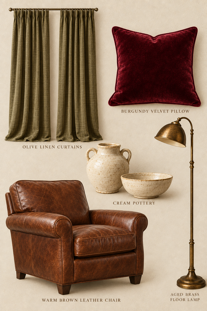
The trick is to let one color lead. In a living room, that might mean olive curtains, brown furniture, and small touches of burgundy in pillows or art. In a dining room, let the wood table be the starting point and add olive linens and burgundy flowers.
This is also a beautiful palette for a reading corner. A brown leather chair, olive throw, burgundy pillow, and brass floor lamp would make even a small spot feel cozy.
For seasonal harvest items, try dried wheat, muted gourds, seed pods, or a bowl of pears. You don’t need all of them—a few natural touches are plenty.
My neutral fall decor ideas offer more inspiration for adding seasonal texture with pumpkins, dried stems, and soft colors.
The Finishing Touches That Make a Moody Space Work
Once you choose an autumn color palette, the textures and finishes help bring it to life.
Add a little aged brass. Try a lamp, picture frame, cabinet pulls, or candleholders. Its warm glow looks beautiful against plum, olive, burgundy, and brown. You don’t have to replace every metal finish in the room to use it.
Bring in warm woods. A walnut desk, oak table, or thrifted wood dresser adds warmth and breaks up large areas of painted color. Shop your house first—you may already have the perfect piece in another room!
Use a patterned area rug. A rug can be your starting point for the whole palette. Choose one with two or three colors you love, then repeat those shades in pillows, curtains, or artwork. Faded floral and Persian-style patterns are especially pretty in a moody space.
Mix in vintage and antique finds. An old landscape painting, a wood chest, or a slightly worn brass frame gives a room character. These pieces don’t need to be perfect. A little age fits right in with this cozy look.
Layer your lighting. Table lamps and wall sconces help rich colors feel welcoming in the evening. If you’re painting, check your samples in both daylight and lamplight before you commit.
Bring a Little Mood to Your Fall Decor
A beautiful fall color palette doesn’t have to start with orange and black. Plum, olive, burgundy, warm brown, and aged brass give you so many ways to make your home feel cozy for the season.
Start small with a pillow, a thrifted frame, or a vase of fall branches. Then build around the pieces you love.
Whether you’re drawn to an autumn forest palette or deeper autumn harvest colors, the goal is a room you’ll enjoy spending time in—long after the pumpkins are put away.
Which palette would you try in your home? I’d love to hear your favorite!